Strategy 10 min read
Data-Driven Decision Making for SMEs: Dashboards and Business Apps
The 5 essential dashboards to steer your SME. KPIs by sector, real-time decision making, and illustrative scenario.
Table of contents11
In many SMEs, decisions are still made from a monthly Excel file that's already out of date the day it arrives, or from informal feedback from the field. It isn't a lack of rigor: getting reliable numbers takes hours of compiling that nobody has.
Data isn't reserved for large companies with analytics teams. Your business application already collects valuable information every day: order counts, processing times, error rates, payment delays. The problem? That data sits in a database instead of being turned into dashboards that support decisions.
This article covers the 5 essential dashboards for an SME, the indicators that really matter, and how to turn your business tool into a control panel — without spending your Monday mornings on it.
Key takeaways
- A good dashboard doesn't show everything: it shows what needs action, with 5 to 7 indicators per view, always compared to a target or a previous period.
- Five views cover most of an SME: executive, sales, operations, finance, HR.
- Hand-compiled reporting is slow, fragile, and often abandoned; reporting fed automatically by your tools gives those hours back to the team.
- Reliable numbers depend on data entry: entered once, checked at input, shared across tools.
- Automatic alerts (unpaid invoice, delay, anomaly) are often worth more than a chart viewed once a month.
Why your decisions should rest on data
An SME owner makes many operational decisions every day: chase a client, restock, assign a team, accept a tight quote. Each relies either on reliable figures or on intuition. Intuition remains valuable — it's built on experience — but it's prone to bias: we remember the last incident, the loudest client, the exceptional month.
The cost of bad decisions
| Decision | Based on intuition | Based on data |
|---|---|---|
| Hire a salesperson | "We have lots of work" → possibly premature hire | Trend in qualified requests and conversion rate → reasoned decision |
| Restock inventory | "Feels like it's moving" → stockout or overstock | Weekly sales and seasonality → right-sized order |
| Launch a new service | "Clients mention it" → a gamble | Requests received and estimated margin → targeted launch |
| Follow up with a client | "Haven't seen them in a while" → wrong timing | Activity history → right timing |
Intuition is valuable for qualitative decisions. For quantitative ones — budget, inventory, resources, pricing — data is a better guide.
The 5 essential dashboards
A good dashboard doesn't show everything. It shows what requires action. Here are the 5 essential views for steering an SME of 20 to 100 people.
1. Executive dashboard — Overview
For: CEO, partners, CFO. Frequency: daily (2 minutes).
Indicators displayed:
- Month-to-date revenue (vs target and vs previous month)
- Gross margin percentage
- Available cash
- Pending quotes (sales pipeline)
- Critical alerts (invoice unpaid for 30+ days, target behind)
2. Sales dashboard — Pipeline and conversion
For: sales director, sales reps. Frequency: daily.
Indicators displayed:
- Incoming requests this week
- Quote-to-order conversion rate
- Pipeline value by stage (prospecting, qualification, negotiation, closing)
- Average time to convert
- Top 5 most advanced opportunities
3. Operations dashboard — Production and delivery
For: operations manager, logistics, field teams. Frequency: continuous.
Indicators displayed:
- Operations in progress / overdue
- Average processing time by operation type
- Resource utilization (technicians, vehicles, machines)
- Delay or anomaly alerts
- Weekly schedule with workload per person
4. Financial dashboard — Cash and profitability
For: CFO, accountant, CEO. Frequency: weekly.
Indicators displayed:
- Cash in vs cash out (cash flow curve)
- Unpaid invoices by age (0-30 days, 30-60 days, 60+ days)
- Margin by client / service / product
- 3-month cash forecast
- Expenses by category
5. HR dashboard — Teams and workload
For: HR, CEO. Frequency: monthly.
Indicators displayed:
- Headcount and absences
- Volume handled per team
- Overtime
- Team satisfaction (if a survey is built in)
- Upcoming deadlines (contract ends, mandatory training)

Comparison table: Excel reporting vs integrated dashboards
| Criteria | Excel reporting | Integrated dashboards (business app) |
|---|---|---|
| Update frequency | Monthly (sometimes quarterly) | Continuous |
| Preparation time | Several hours per report | None (automatic) |
| Data reliability | Risk of copy-paste and version errors | Data read directly at the source |
| Customization | Limited (complex macros) | Filters and role-based views |
| Sharing | Email attachment | Direct link, permission-based access |
| History | Multiple files, confusing versions | Full history, automatic trends |
| Alerts | None (passive discovery) | Automatic notifications |
| Real cost | "Free," but hours of preparation every month | Included in the application cost |
The Report That Sends Itself: Hours Back Every Month
Compiling reports by hand is the textbook repetitive task: export from three tools, paste into a spreadsheet, check, format, send. A few hours a month for an internal report — often far more for businesses that produce reports for their clients, which is daily life for marketing agencies, for example.
Automating that flow means figures are collected, consolidated, and sent with no one stepping in, plus an alert when an indicator goes off track. Automatic dashboards and reports are part of our custom business tools. To estimate the time you currently spend on reporting and re-keying, try the time savings calculator.
Data-driven management mistakes
- Too many indicators — A dashboard with 30 indicators doesn't inform, it drowns. Aim for 5 to 7 per view, prioritized
- Data without context — "120 orders this month" means nothing without comparison (vs target, vs previous month, vs same month last year)
- Reports without action — Every indicator must answer: "What do I do if this number is red?" If there's no answer, it's useless
- Ignoring data quality — Poorly entered data produces wrong analyses. Input quality is a prerequisite (see our article on UX and ergonomics)
- Not automating — If reporting requires manual handling, it will be late or skipped. Reporting automation is essential
Illustrative scenario: from monthly Excel to continuous dashboards
Illustrative scenario built on realistic assumptions: not an actual client.
Profile: IT services company, 35 employees. Monthly Excel report prepared by the executive assistant (about 6 hours a month).
Problem: the CEO finds out about issues weeks late — an unhappy client who leaves without warning, a project budget overrun spotted too late.
Planned solution: 4 dashboards built into the business application (executive, sales, operations, finance), fed automatically, with alerts.
What you can aim for:
- Anomalies detected as they happen rather than at month-end
- The monthly compiling hours eliminated
- Earlier signs of client dissatisfaction (rising tickets, lengthening delays)
- Tracking of hours consumed per project, so overruns can be corrected before they happen
Building a data culture
Technology alone doesn't create data-driven decisions. You also need a shift in habits:
Start small: one department, one dashboard, one weekly review meeting. Prove the value before expanding.
Make data accessible: dashboards that need IT support to update are useless. Views that update themselves become part of the daily routine.
Question the numbers: when data contradicts intuition, investigate. Sometimes the data reveals a blind spot; sometimes it's incomplete. Either way, the conversation improves decisions.
Measure what matters: the temptation is to track everything. Resist it. Focus on the handful of metrics that directly drive decisions your team makes every week. As your application evolves, you can add more.
Our data-driven approach at Iselia Projects
At Iselia Projects, the tools we deliver include the dashboards you need to decide, and the reports that should go out on their own.
Our method:
- Key decision identification — We list with you the decisions you make most often and the data needed to make them
- View design — Each dashboard is designed to answer its audience's questions in under 30 seconds
- Flow automation — Data feeds the dashboards with no manual handling; alerts are set on your critical thresholds
- Export and sharing — Every view can be exported to PDF or CSV for meetings, your accountant, or your banker
For your data to be usable, it must come from reliable sources: your app must be properly integrated with your existing tools.
Our support plans then let these dashboards evolve with your needs.
Data quality: garbage in, garbage out
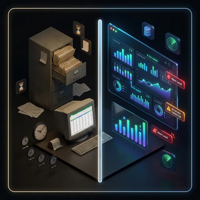
The most beautiful dashboard is worthless if the underlying data is unreliable. Protect data quality with these practices:
- Validation at entry — Enforce formats, ranges, and mandatory fields in your application forms
- Deduplication — Regularly scan for duplicate records (clients, products, contacts)
- Single source of truth — Each data point should be entered once and shared through connections between tools, never copied manually between systems
- Data ownership — Assign responsibility for each data category to a specific team or person
Frequently Asked Questions
How much does adding dashboards to my business app cost?
It depends on the number of views, the data sources to connect, and the calculations required. Planned from the start, dashboards are a modest share of the budget; added later, they can cost more if data is scattered. The return is measured in reporting hours eliminated.
Can dashboards be added to an existing tool?
Yes, provided the tool stores its data in a structured way (database, regular export, or a connection interface). Adding 2 or 3 dashboards usually takes a few weeks.
Is my data sufficient for effective management?
If your tool records dates, amounts, statuses, and owners for each operation, that's enough to build relevant dashboards. What matters isn't the quantity of data but its structure and reliability.
How do you ensure data reliability?
Reliability rests on 3 pillars: good input ergonomics (fewer errors), automatic consistency checks (rejecting outliers), and a single source of truth (each data point entered once).
How many dashboards do I need?
For an SME of 20 to 50 people, 3 to 5 dashboards cover the essentials: executive, sales, operations, and optionally finance and HR. Start with the executive dashboard and add the others gradually.
Do dashboards work on mobile?
Yes, if they're designed to adapt to screen size (responsive design). The CEO can check key indicators from a phone in seconds, even on the go, and receive alerts as notifications.
Conclusion: data-driven management is faster, more accurate management
The data your application collects every day is a largely untapped resource. Turned into clear, up-to-date dashboards, it becomes a concrete advantage: faster decisions, and compiling hours handed back to the team.
The 5 dashboards in this article don't require a data science department. They require a business tool designed to collect, structure, and display the right data to the right people.
Want to turn your data into decisions? At Iselia Projects, the assessment is free and with no commitment: in 30 minutes, we review your repetitive tasks and your tools, then estimate the hours you could get back. Book your free assessment →
Go further
From this guide to your hours
- Automation Custom business tools Internal apps, client portals, dashboards and automated reports designed for your industry and connected to your data — you own the code.
- Calculator Estimate my hours back Free calculator: your tasks, your volumes, an indicative estimate of the hours saved.
- Support Support plans Monitoring, maintenance and improvements of your automations after go-live.